I devised channel packaging for Comedy Central that enabled them to find and engage with their audience better.
About
Comedy Central is an Indian TV channel with English language comedy content programming, and a localised version of the international brand of the same name. Launched in 2012, they had taken on the same packaging as the international version. They approached seeking a fresh, elegant, and a more restrained look, aimed at the young urban Indian seeking English language content, under an all positioning and philosophy: Your Happy Place.
My involvement on the project started with an aim to arrive at new visual language that needed to address certain requirements — a reduction in graphic complexity, reimplementing the existing identity, using existing typography and studio imagery more effectively, and usability improvements that the team would to like integrate. I presented some directions that best addressed these, and few sessions later an elementary framework was conceived. Additional aesthetic attributes and motion were then integrated to make it a modular, scalable visual system which addresses the On-Air, Marketing and Digital communication platforms for the channel.
Brand Video
Design Language
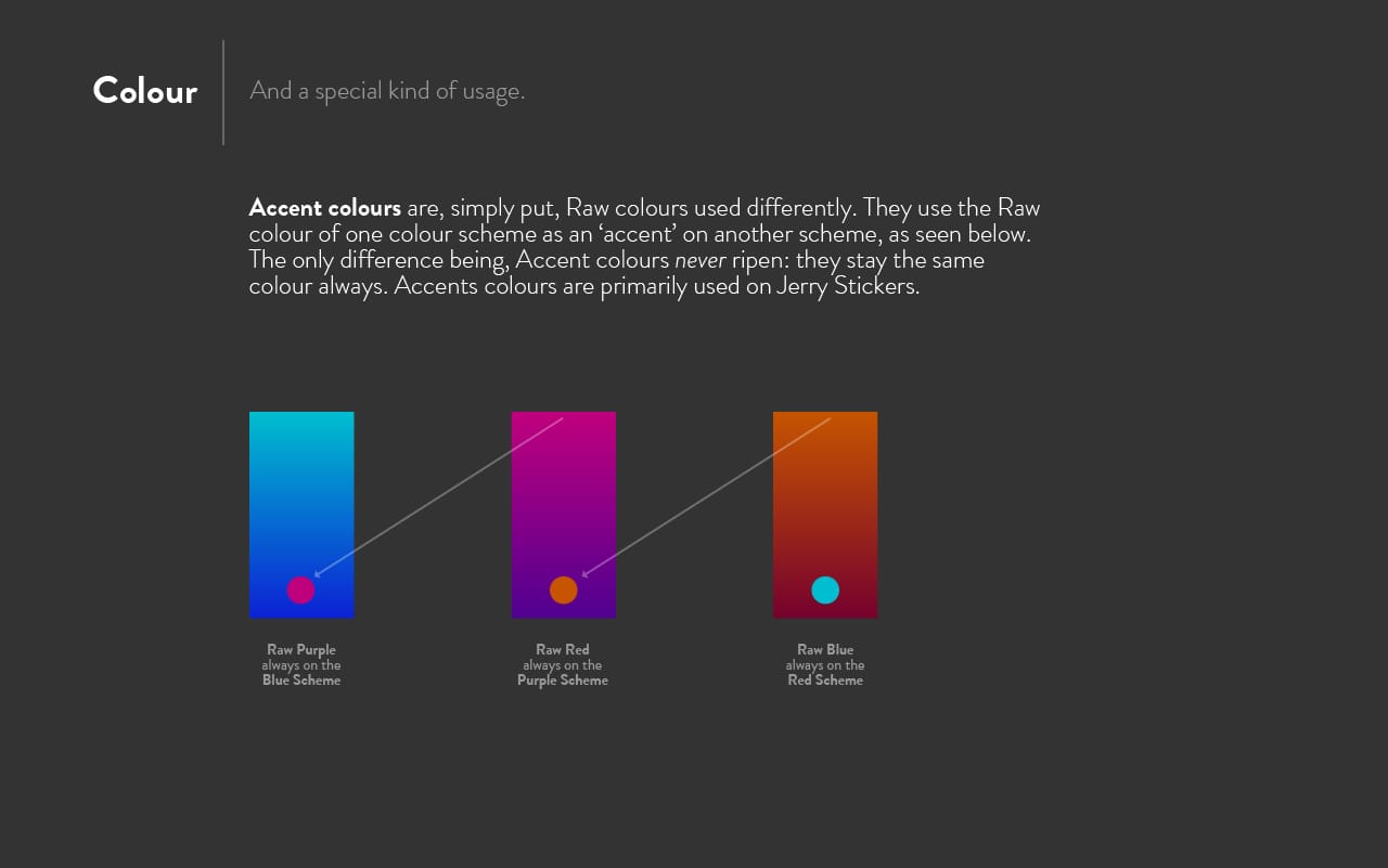
The design language for this new edition of Comedy Central was built on a simple idea: to construct a modern, elegant exhibition of calmness on broadcast. I proposed a direction which stood in contrast against the conventional abundance of colours and 3D motion on similar network channels at the time. It reduces visual elements down to the bare essential: just enough footage, imagery, colour (a simple 3-colour system), and type (Brandon Grotesque and the delicious Eames Century Modern, but used in a new way). It then ties them together using gentle movement which takes influences from contemporary cues in interface design to create a fresh, cohesive aesthetic. This then acts as a foundation for interesting writing, arrangement and edit to create a brand experience that amplifies to their new positioning.
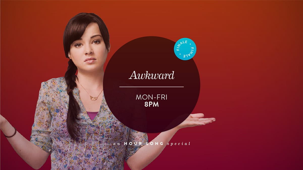
Promo Elements
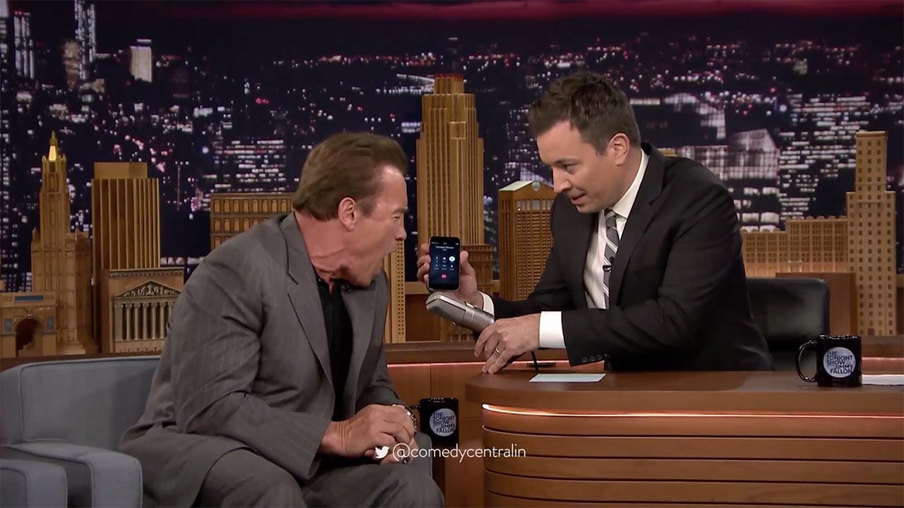
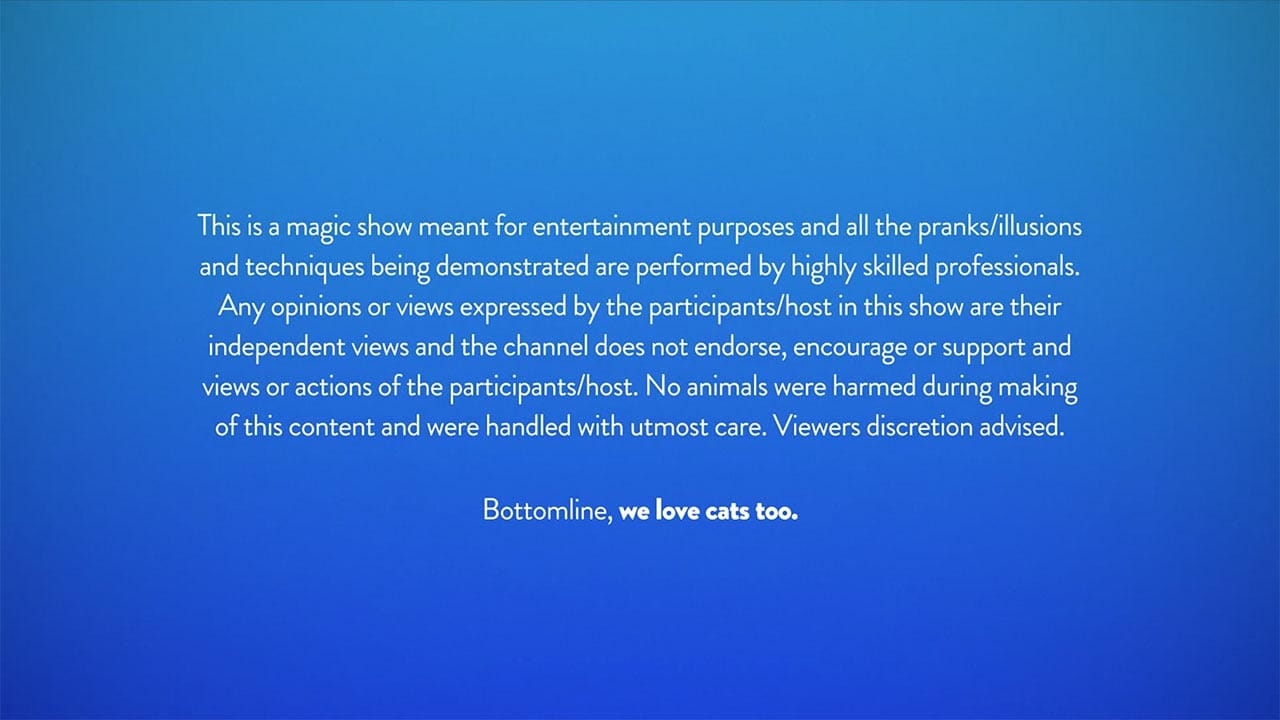
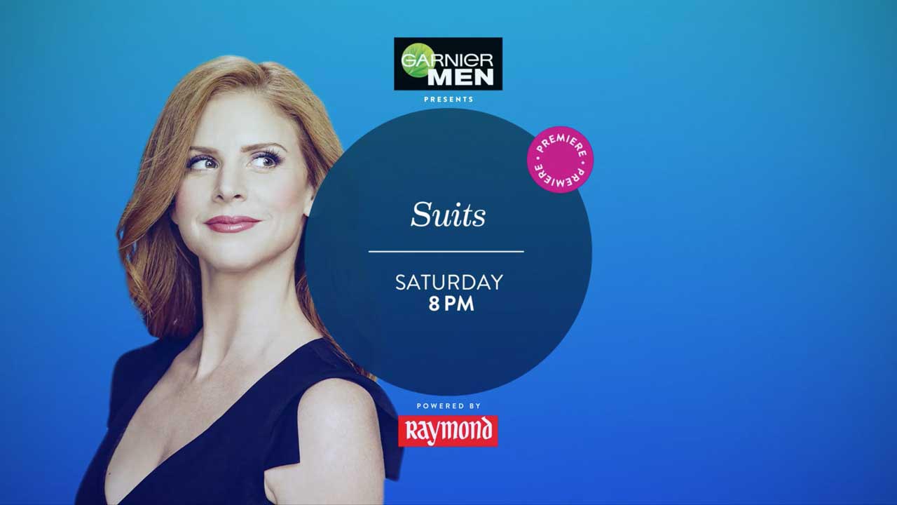
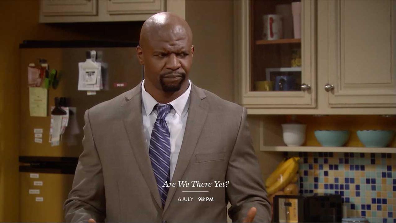
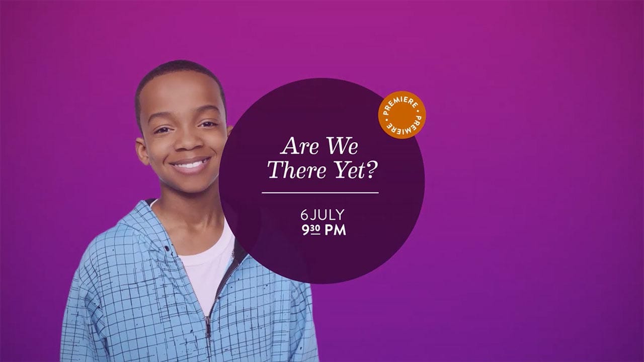
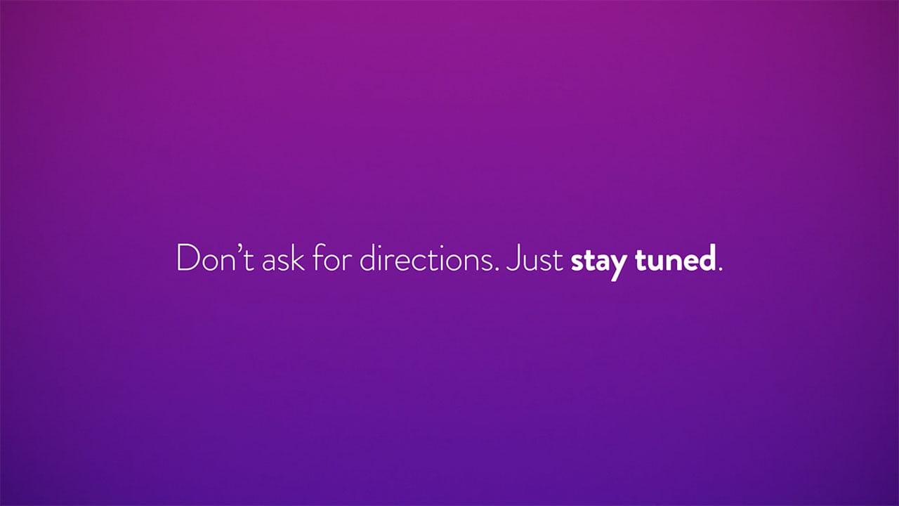
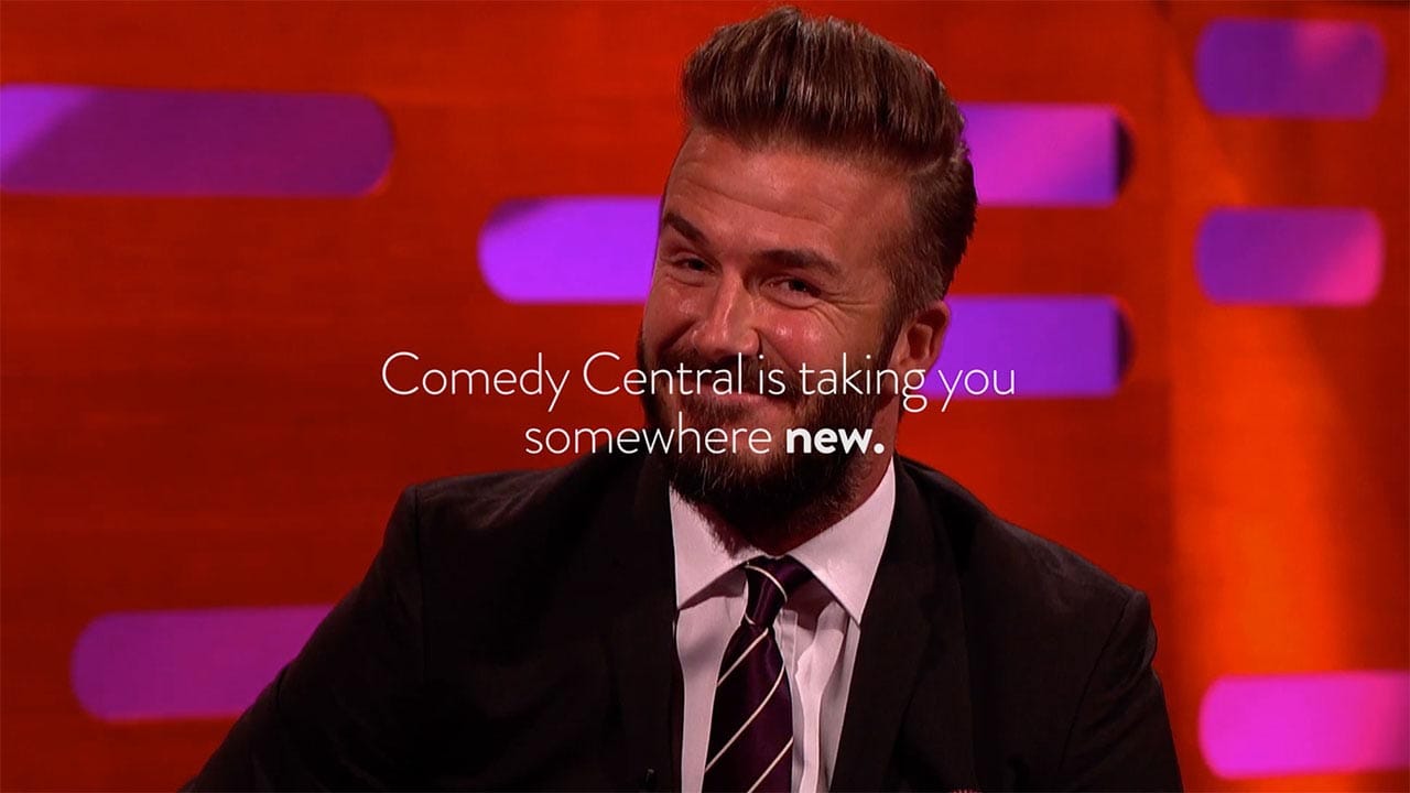
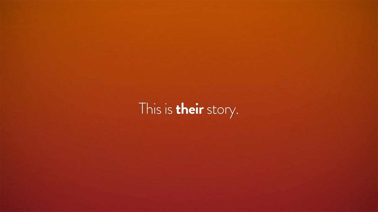
Examples of title cards, text on footage, lower thirds and end pages, all modular components that come together to make a Promo, an advertisement that promotes programs that are scheduled to be aired on the channel at a different time.
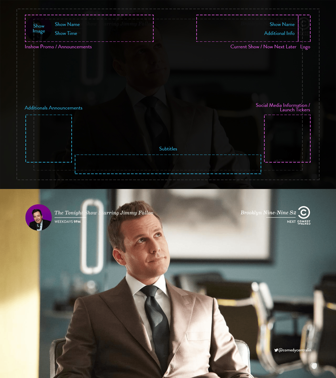
In-Show Elements
The in-show elements borrow visual cues and heirachies from elements of a promo, but mutes the use of colour to give a consistent non-invasive experience during an on-going show.
Motion
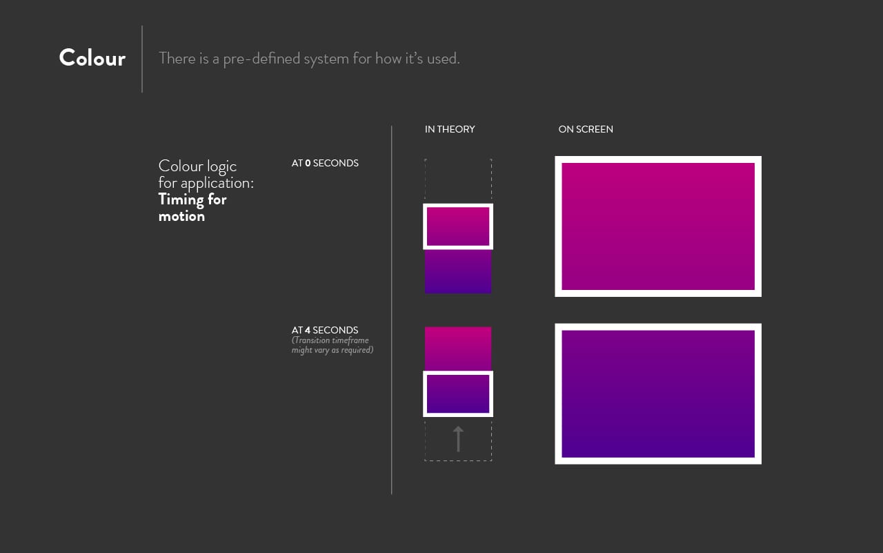
It's easy to get carried away with motion design for broadcast considering the freedom and the accommodating nature of the medium. To arrive at each component of this language, I would first look at the functional expectation from a transition and then attempt to integrate as less motion design into it as possible. This eventually resulted in an unobtrusive, consistent experience built using a mixture of displacement, top-down wipes and moving gradients. Here are some more examples, apart from the brand video above.
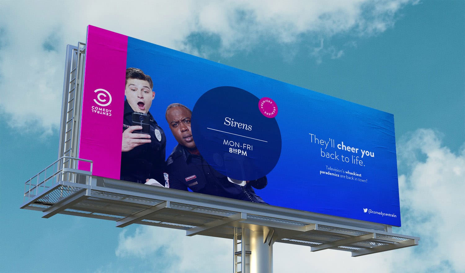
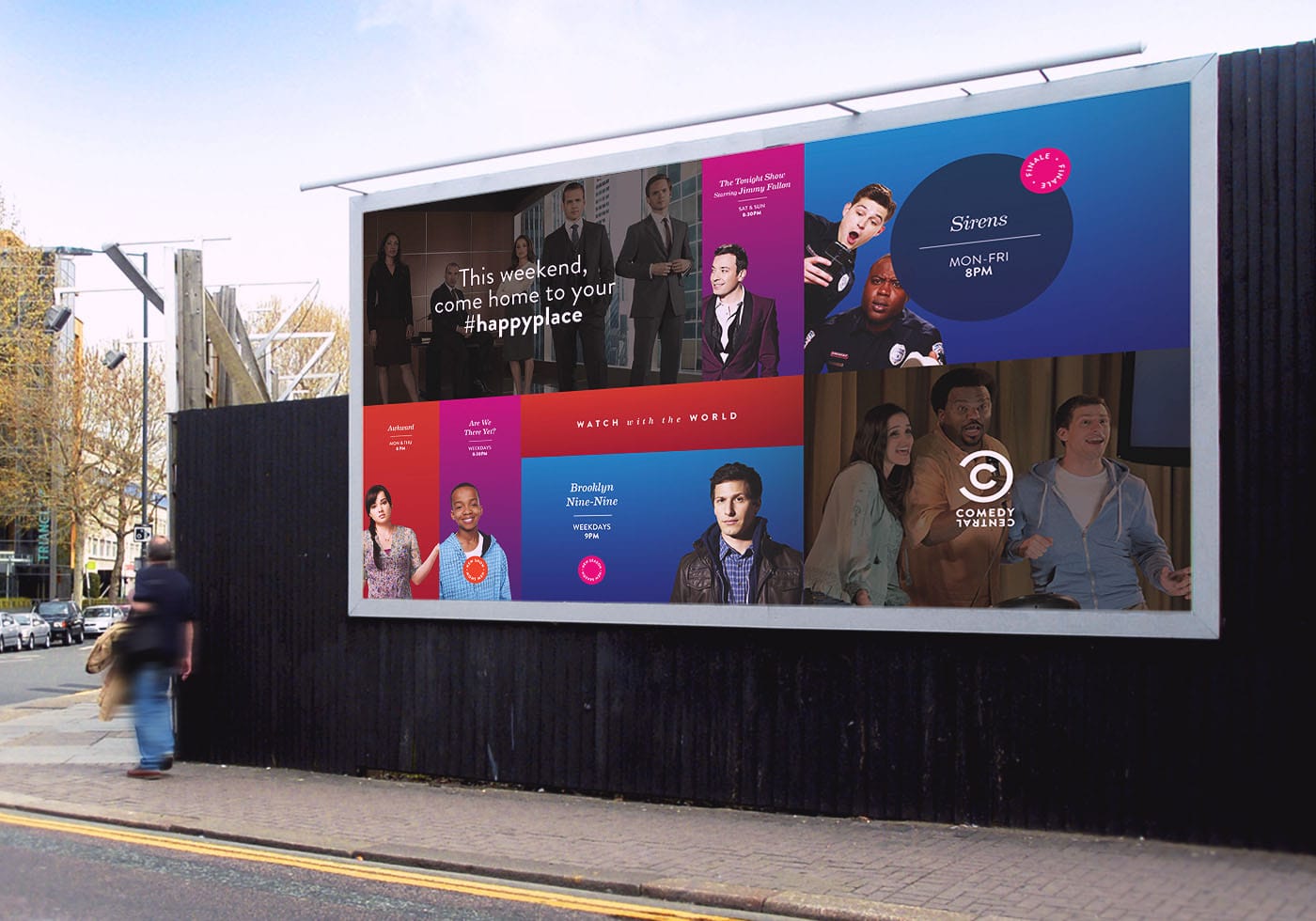
Off-Air & Marketing
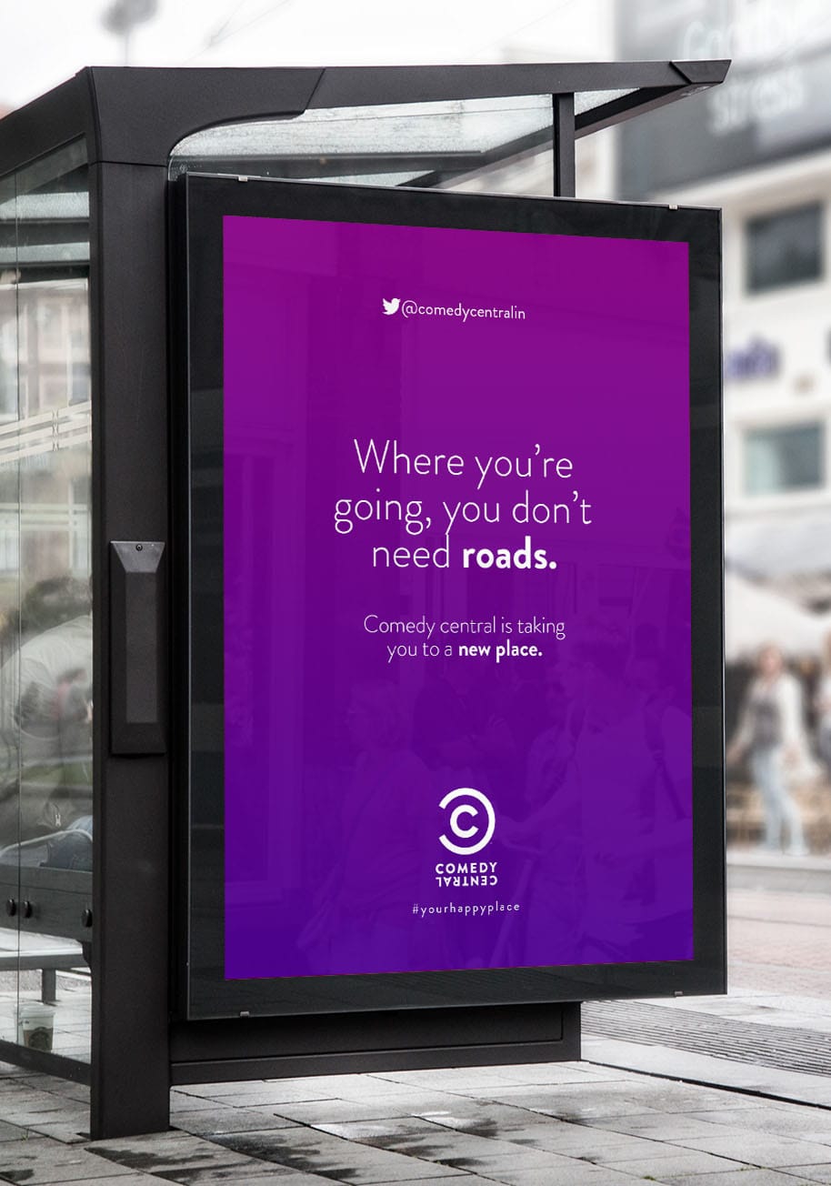
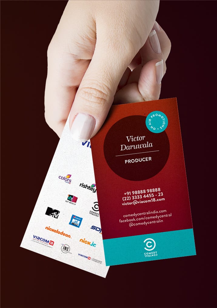
The Off-Air material expands the design language to incorporate alignment and layout variations to adapt to the various aspect-ratios possible, and the requirement of all content to confine to a single visual space, instead of having the additional dimension of time as it was for On-Air.
Excerpts From Guidelines
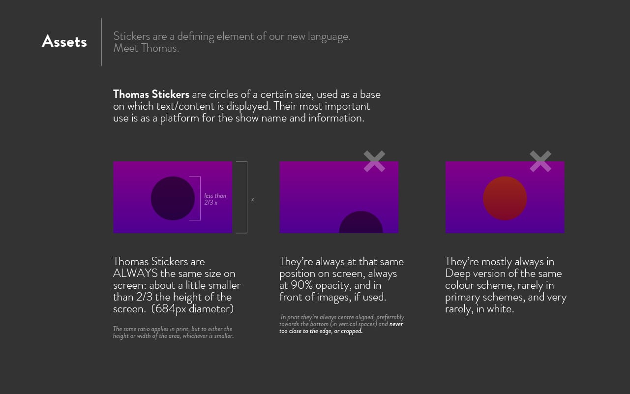
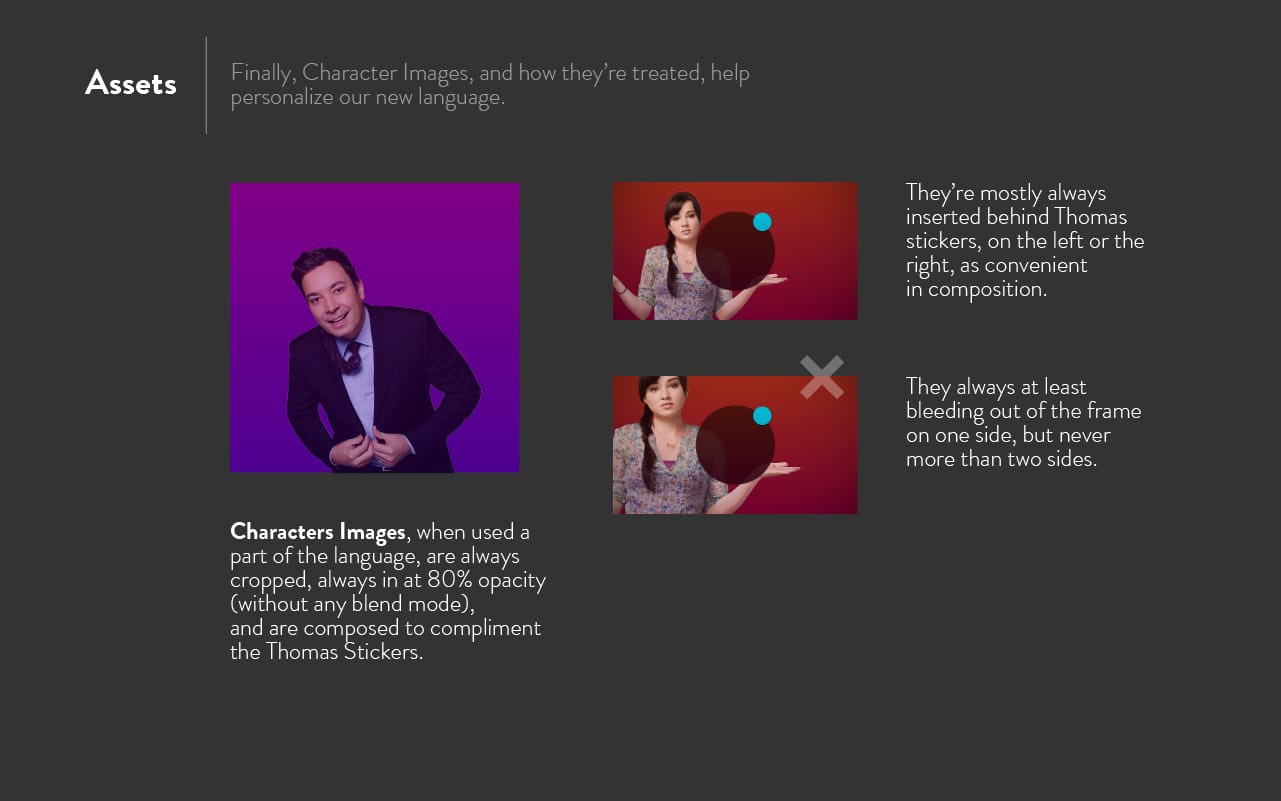
I enjoy style-guides. They help convey the single important thing about a good design language: consistency in reproduction and usage. Here are some excerpts from a brief set of guidelines I initially wrote that helped me build consequent deliverables, and keep everyone involved on the same page before the launch date.
Impact
The exercise also eventually helped streamline better workflows specifically for the producers: one that could help them focus on the writing and humour rather than the dependence on visual effects or graphic execution.
Viewers have since mentioned the channel to be easy-on-the-eye, considerably more accessible, and a polished experience. This has shown in the anticipated rise in viewership numbers.
Comedy Central India won Gold for the Best In-house On-Air Branding Design at Promax India in May 2016. It also picked up a Silver at Promax Asia in the same category later that year.