I came into type design due to curiosity; I stayed because of how meditative the drawing of alphabets can be.
About
I began to explore type design as to dive deeper into form exploration, and due to curiosity in the workings of typography arising from the importance of it's role in my previous projects. This eventually resulted in keep interest in the study of notan in general, and the delicate nuance with which all form is constructed and manipulated.
Type design is an ongoing exercise in making choices, refinement and sensitivity and eventually developing a cadence for it. I seem to learn new things about it every few hours. This page is a documentation of my progress. All typefaces work shown here are work-in-progress yet. Some of them or their derivatives should see publishing in the near future.
Sault
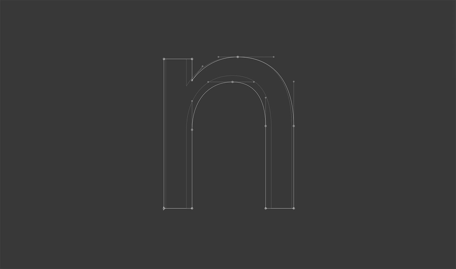
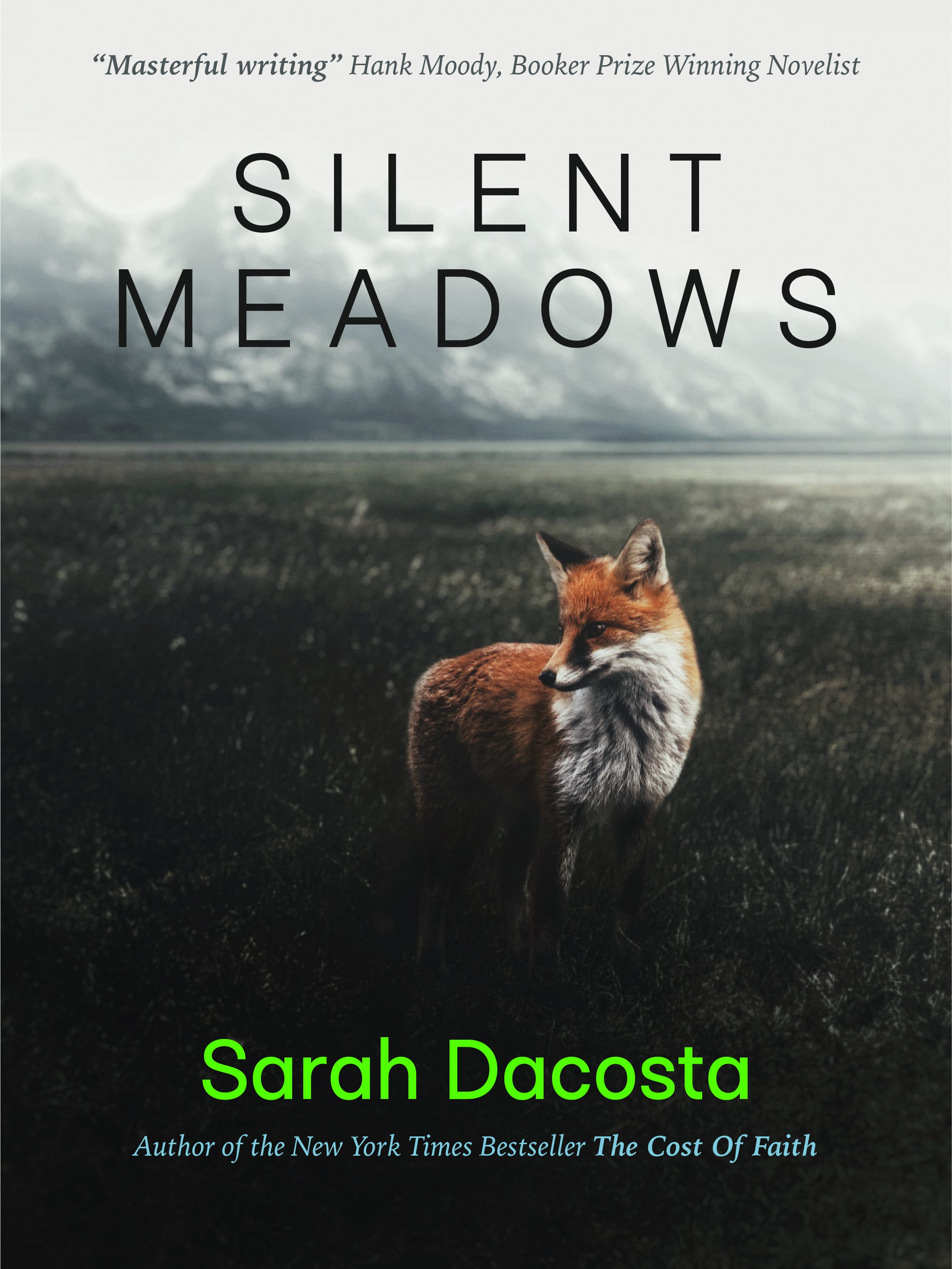
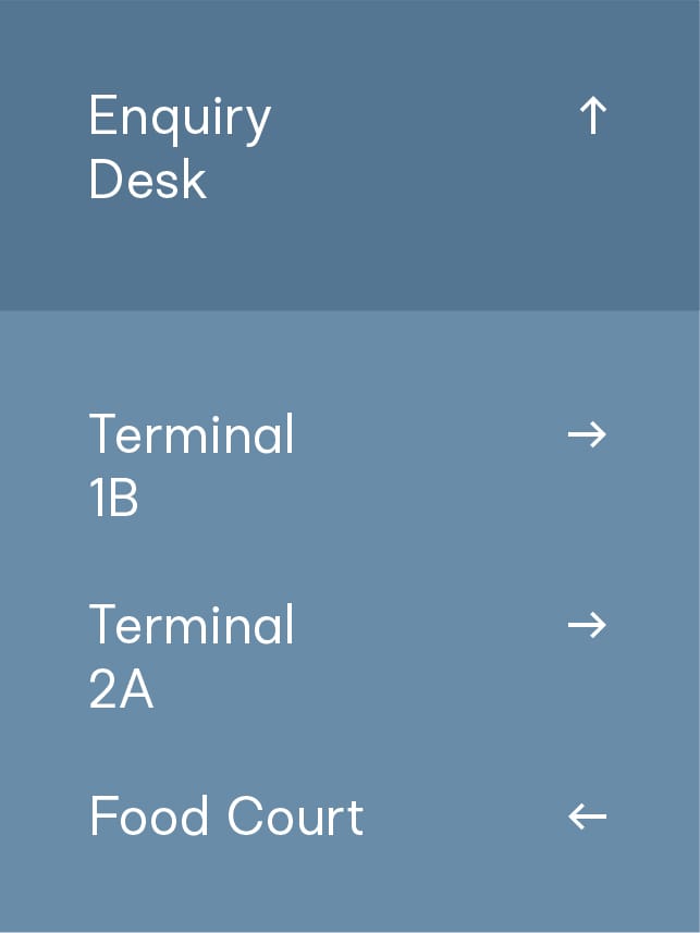
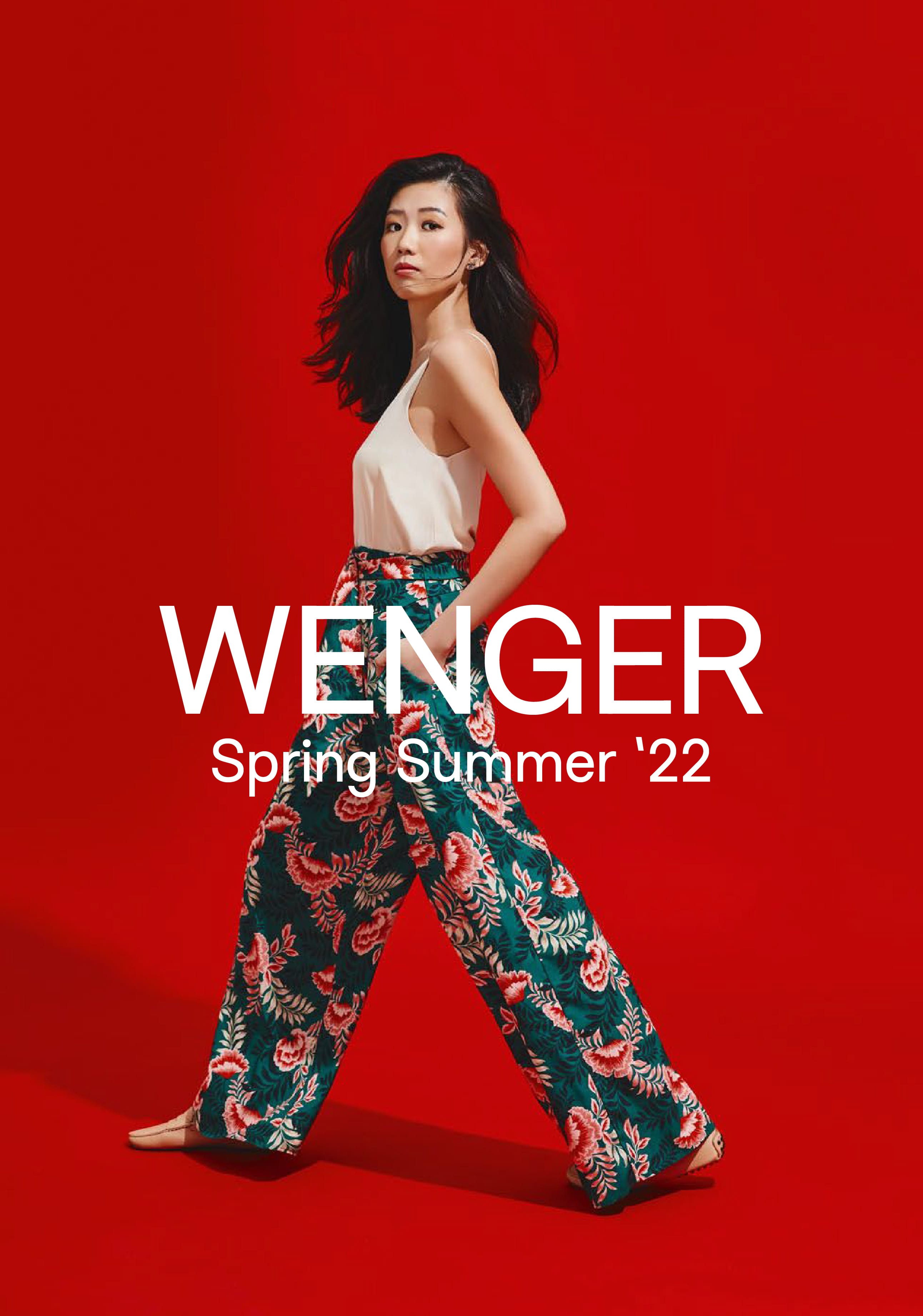
Sault is one of the two typefaces used on this website. It is one of the first typefaces that reached a level of acceptable refinement, and one that felt like it had the potential to be more. I have had fondness for grotesque proportions and it's modern counterparts since I began to explore typography in design school. Sault is my take on what an unassuming versatile san-serif might be.
I intend to complete ten weights for Sault: 5 Normal weights and 5 of their italic counterparts. Work on the italics will start once I resolve the remaining Semi-Bold and Bold weights.
Current Version 0.30
Samples Of Application
Coren Display
Coren is the first proper Latin serif I have been working on, and is influenced by my adoration for modern typefaces based on Didone and wedge-carving conventions like Noe and Grifo. It has evolved a fair bit since the initial drawings.
Current Version 0.27
Zarella
Zarella is a geometric san-serif with squarish, extended proportions and provocative ink-traps. I am currently working on the Light type-weight, and intend to build this out as a variable font on the width, weight and ledgibility axes over the next 18-months.
Current Version 0.21
Cini All Caps
Cini All Caps is a fun little display typeface based on a handwriting style. Referencing the distortion due to haste in writing, the widths are varying, and the joints of certain alphabets are converted into smooth curves. This leads to a sense of informal momentum as a character of the typeface. Very early in development.
Current Version 0.12