For Urbo, I created a brand identity system that gave it more personality (and thus a better platform for customer retention) than any competing restaurant around.
About
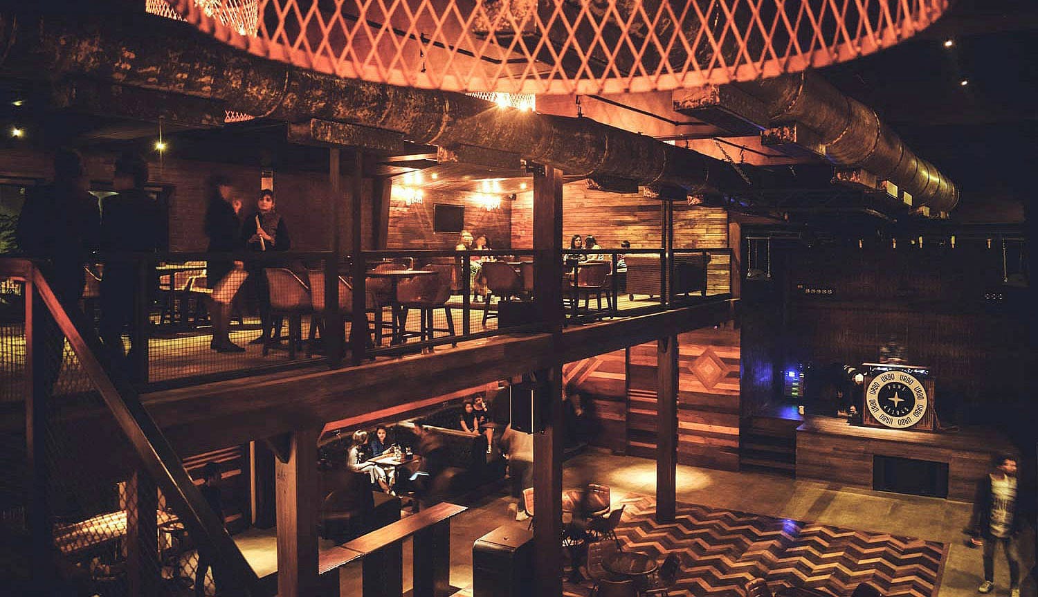
Urbo is a standalone restaurant and lounge located in Baner, Pune. Baner has seen a rise in young professionals due to various multinational companies choosing to set up office buildings in the area. In 2017, the client came seeking a branding and positioning exercise that helped their new venture stand out, and be perceived as the one-stop establishment of choice for dining, social gatherings and night-outs for patrons who reside in the vicinity.
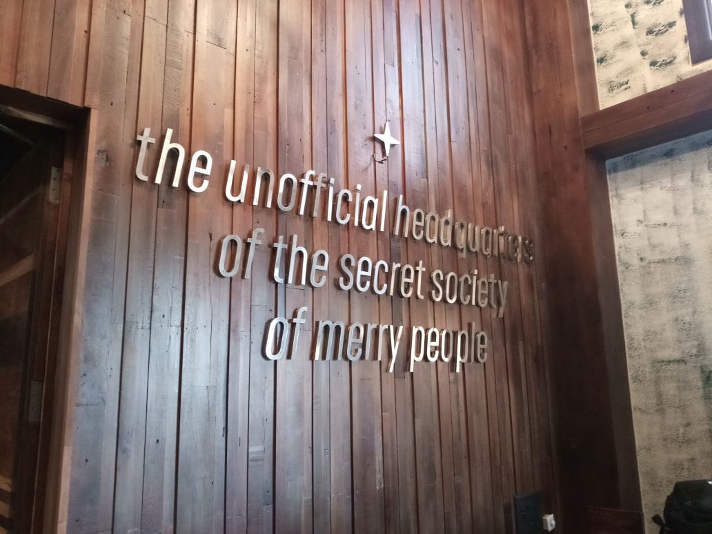
Urbo already had it's architecture defining a certain direction: a two-floor shed with its exposed bricks and steel columns. The interior designer too wanted to work with artefacts, planks and wrought iron as elements apart from the vintage choice of furniture. I pitched a direction and a narrative that compliments this environment, and the client chose to go with an aesthetic that places Urbo as a city centre pub in America of the '40s-'50s but set a rustic, repurposed industrial warehouse.
Logo
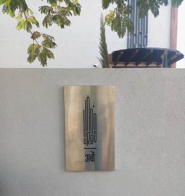
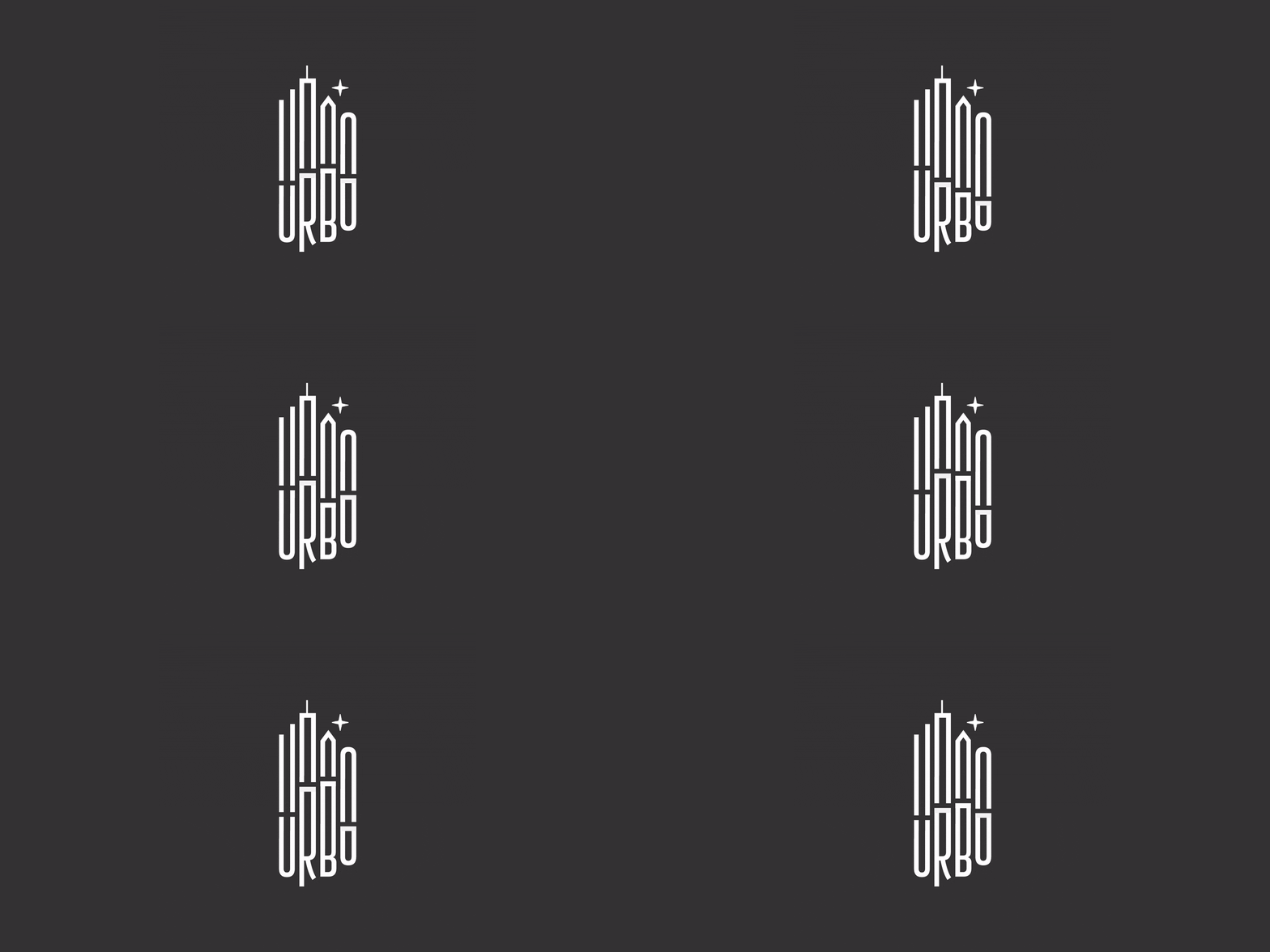
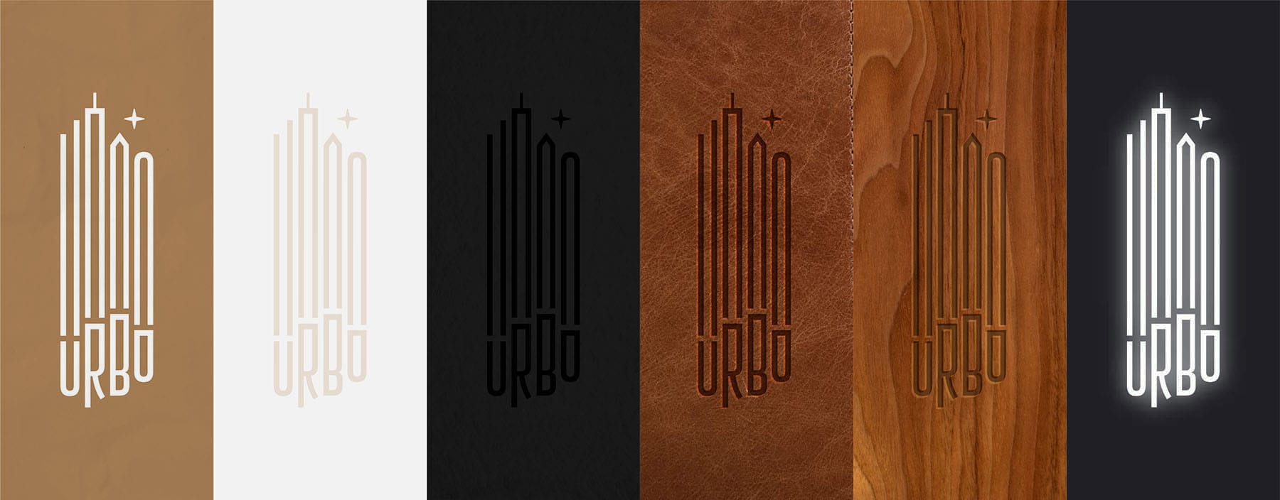
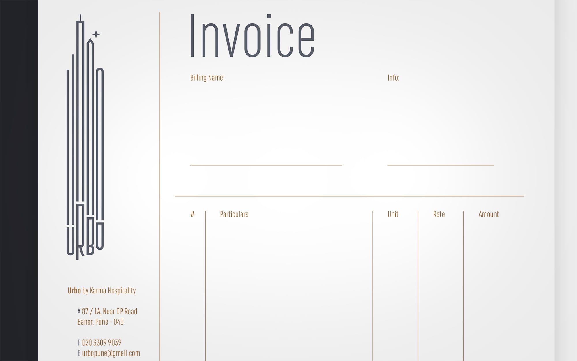
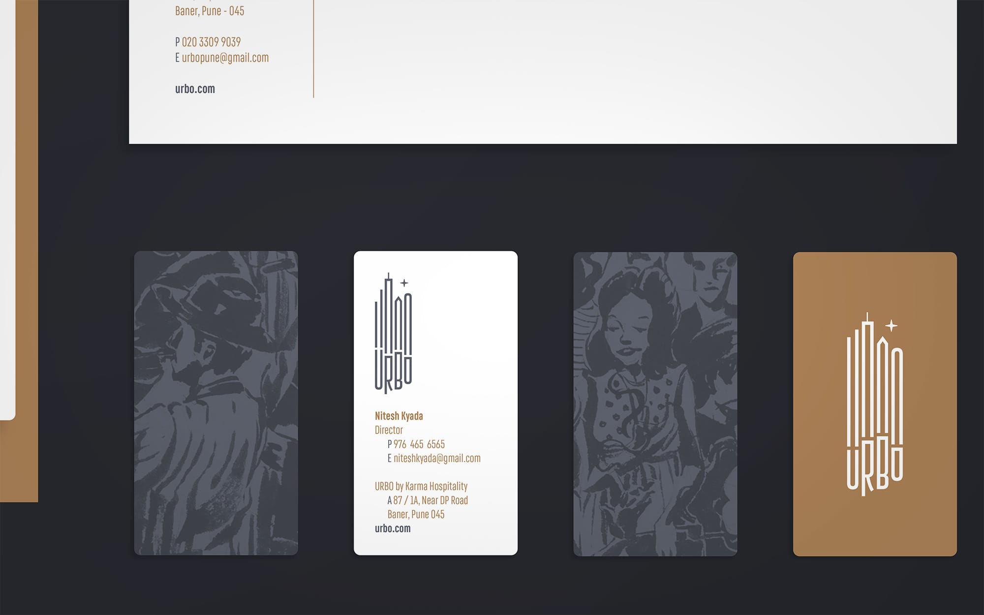
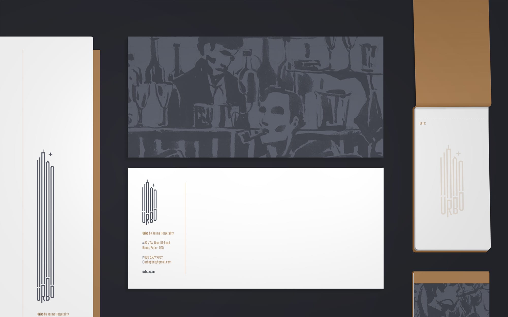
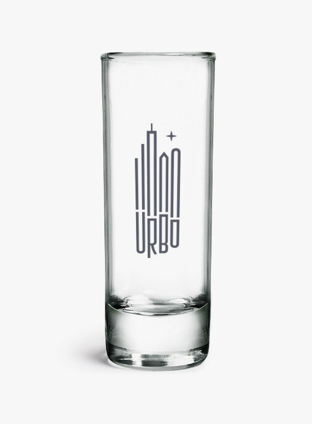
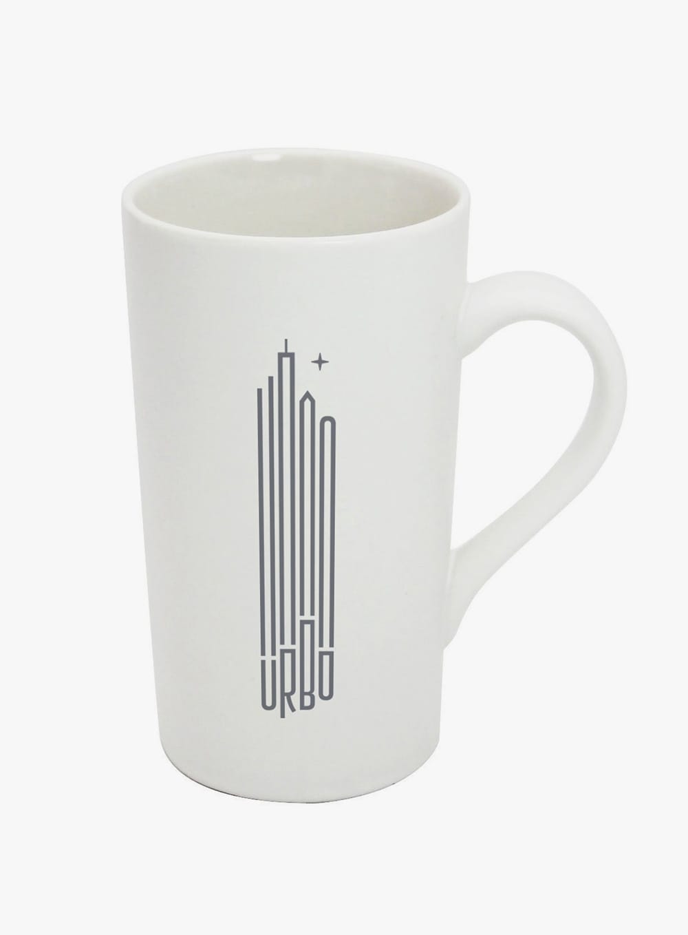
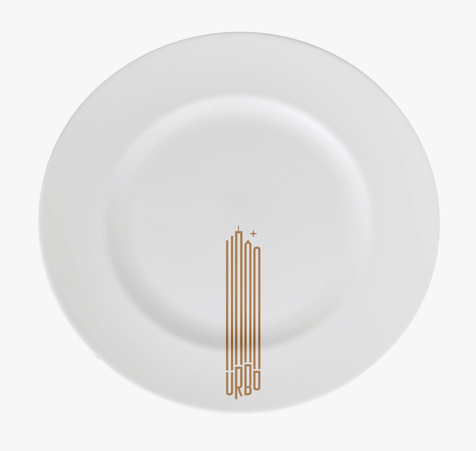
The primary logo for Urbo is fluid in it's form: it exists in iterations of different sizes depending on application. It integrates the alphabets with a skyline at night, and where possible it integrates vertical motion. More literally, it hints at fader buttons on a sound mixer or the valves on a trumpet, while symbolically they are intended to be the streets of a city coming alive at night.
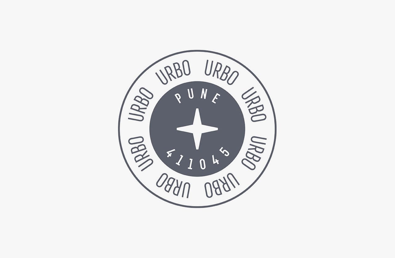
It has secondary logo more akin to a stamp for alterate applications. There exists a third logo format: a reduced lockup with just the star and description text, for application on mastheads or entry plates of a sub-location.
Visual Language
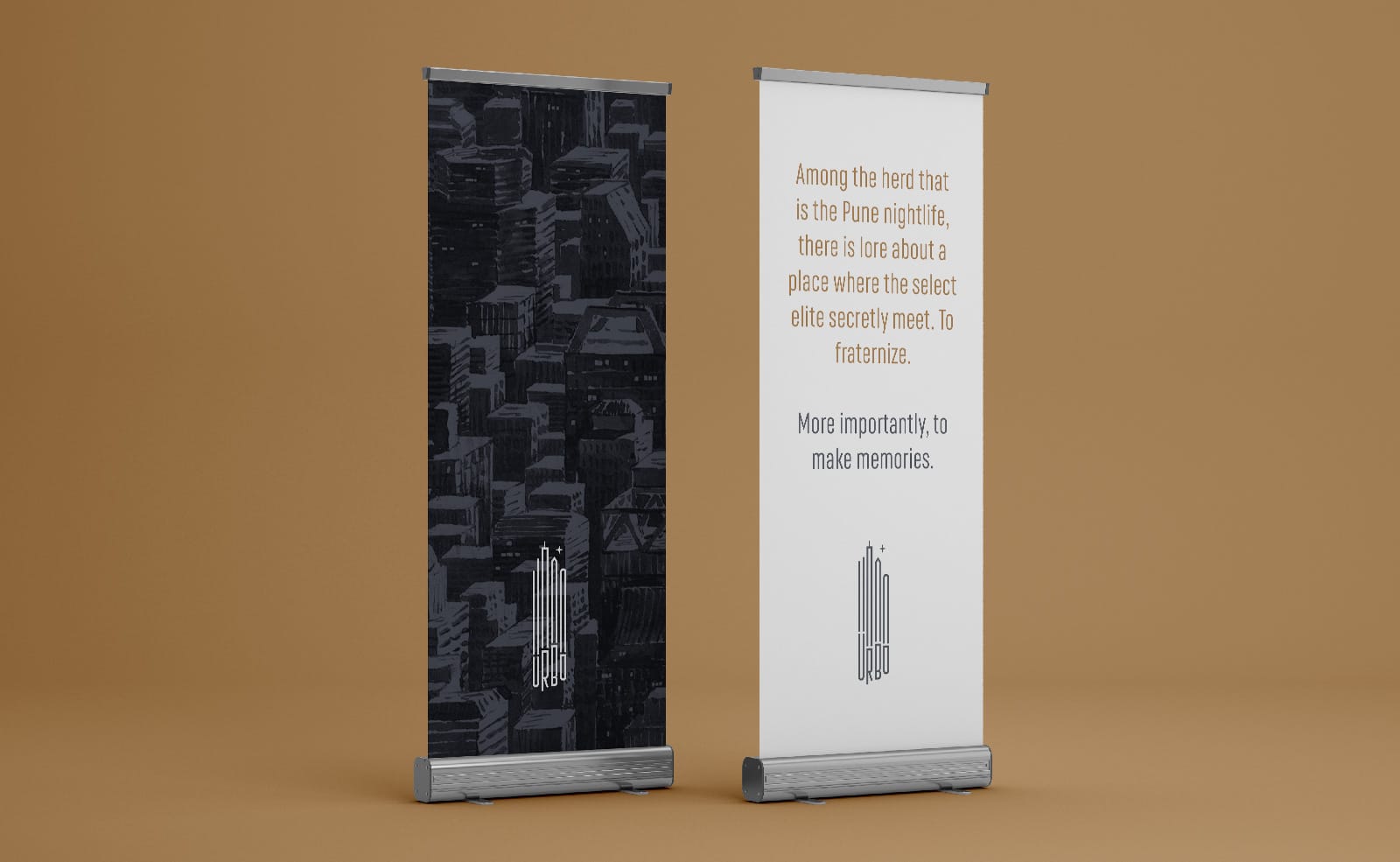
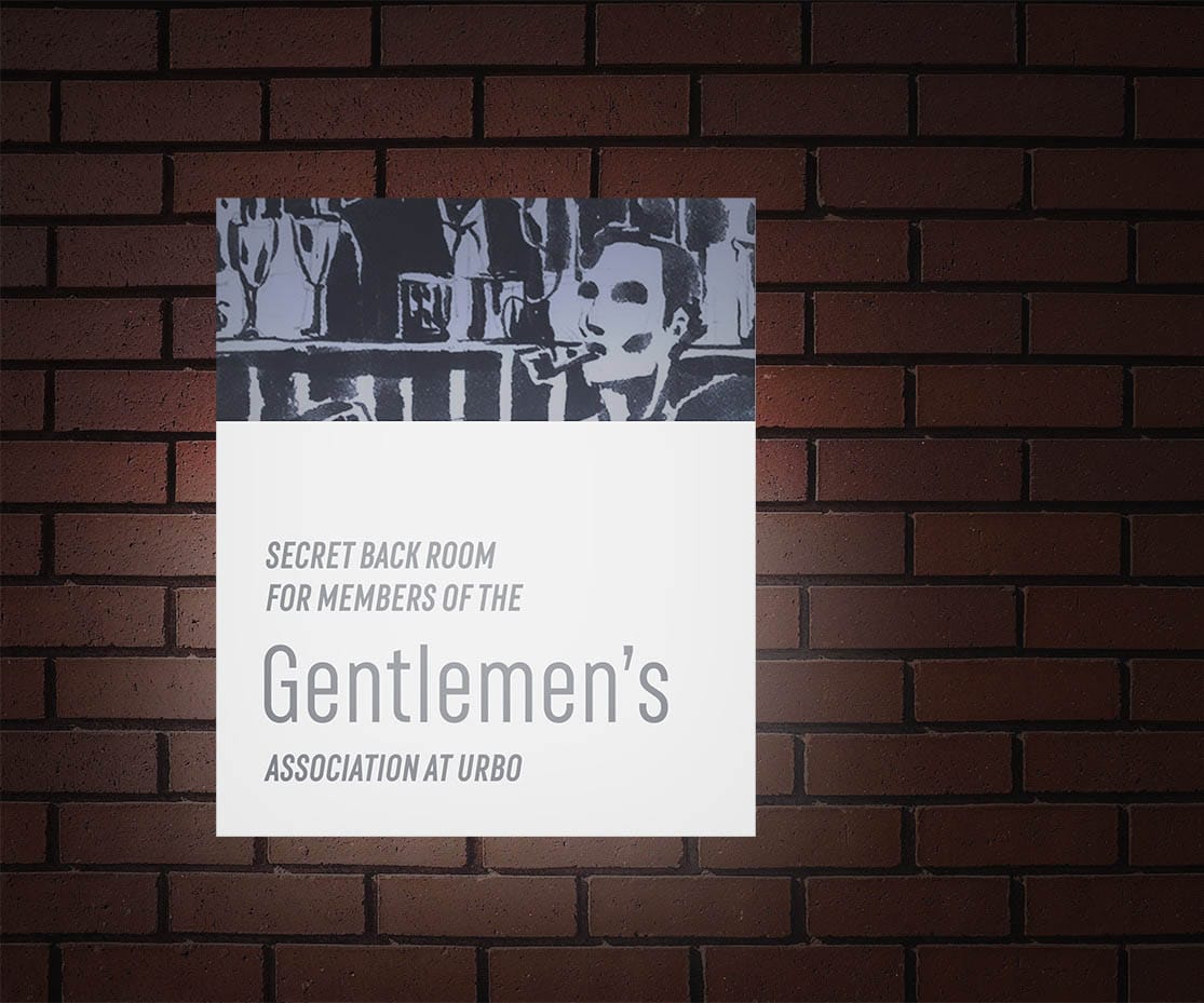
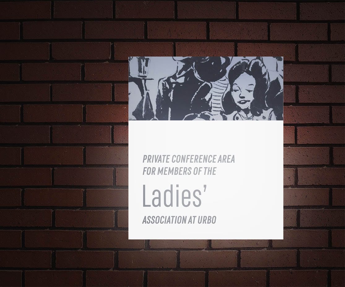
Urbo establishes its primary brand expression with a two-tone water-colour illustration inspired by the aesthetic used in newspaper comic strips or magazines of yesteryears that brings more character and life to the applications.
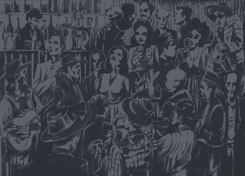
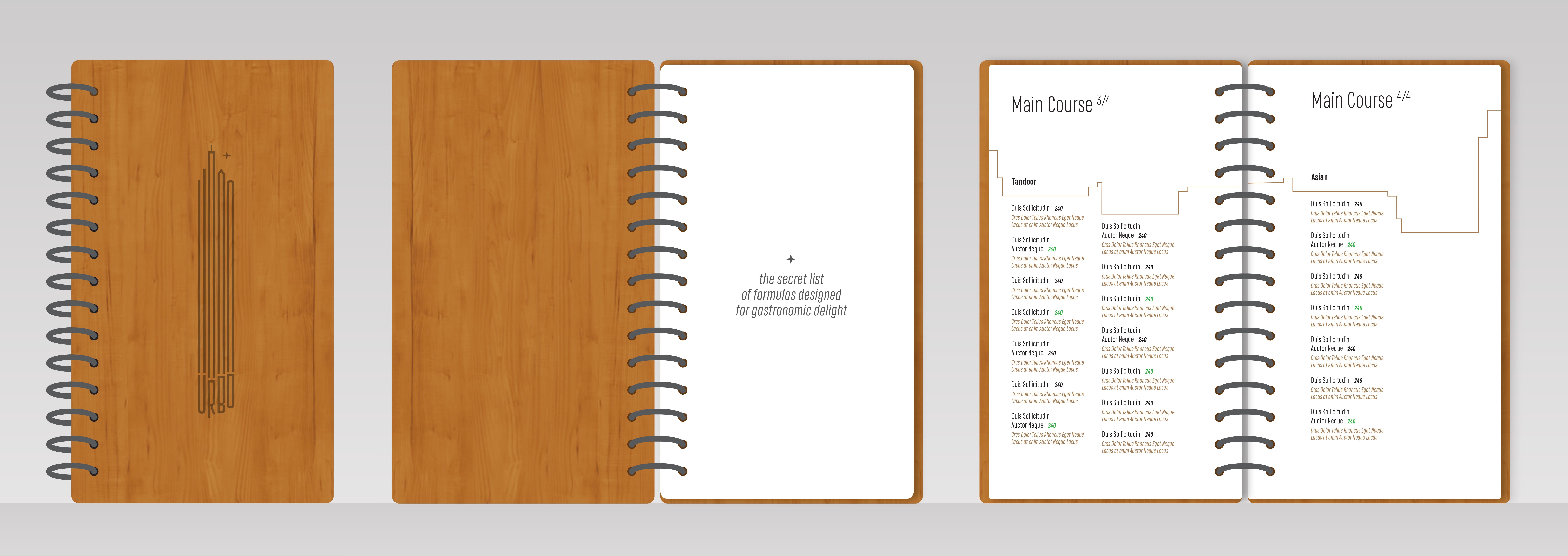
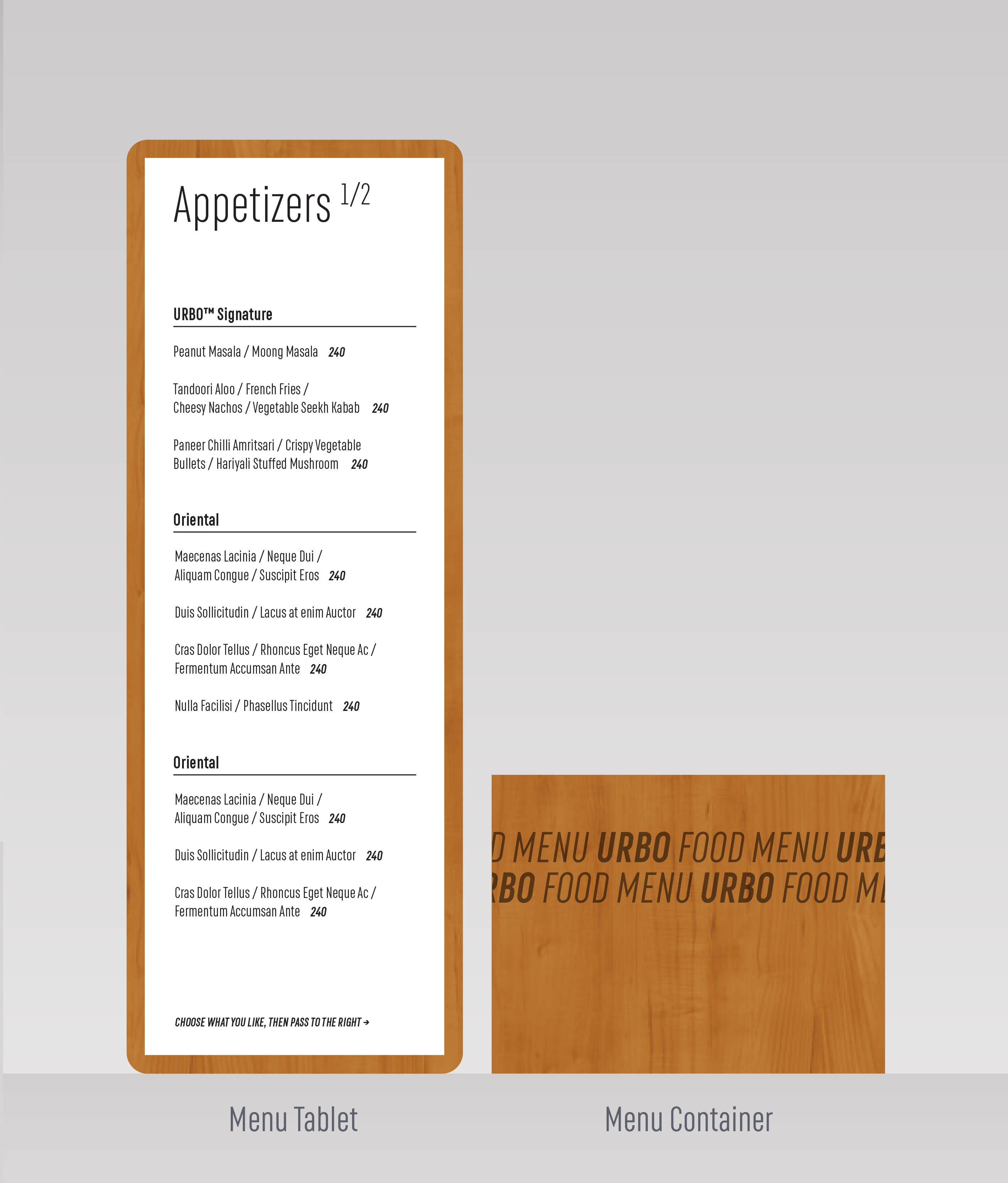
As with most brand identities, pre-established design cues gave direction to a lot of the decisions made while building out the visual language for Urbo. These helped decide the graphic aspects such as the vertical single-column page-layouts of the menu, or going with a single condensed geometric typeface (RF Rufo) for most applications.
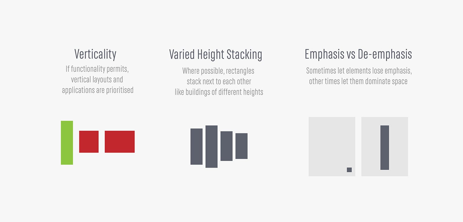
Applications
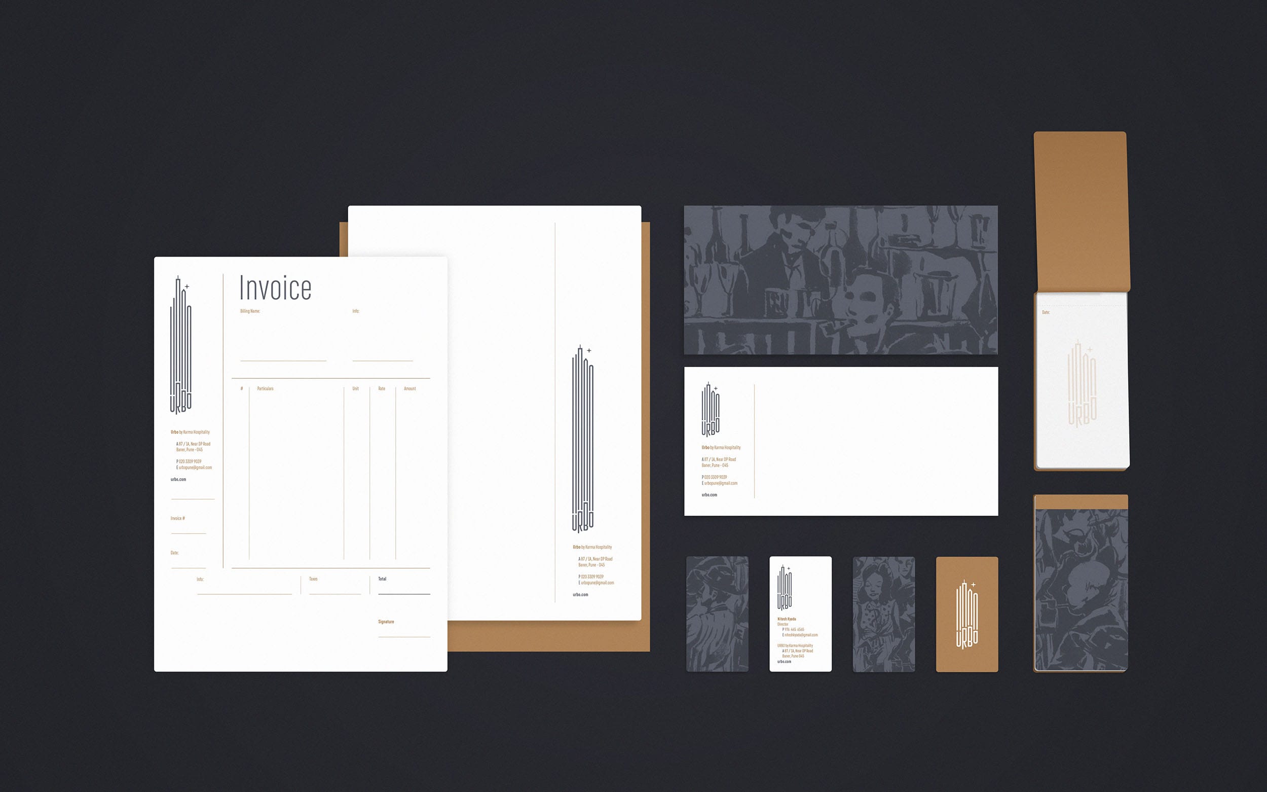
Signages for the washrooms.
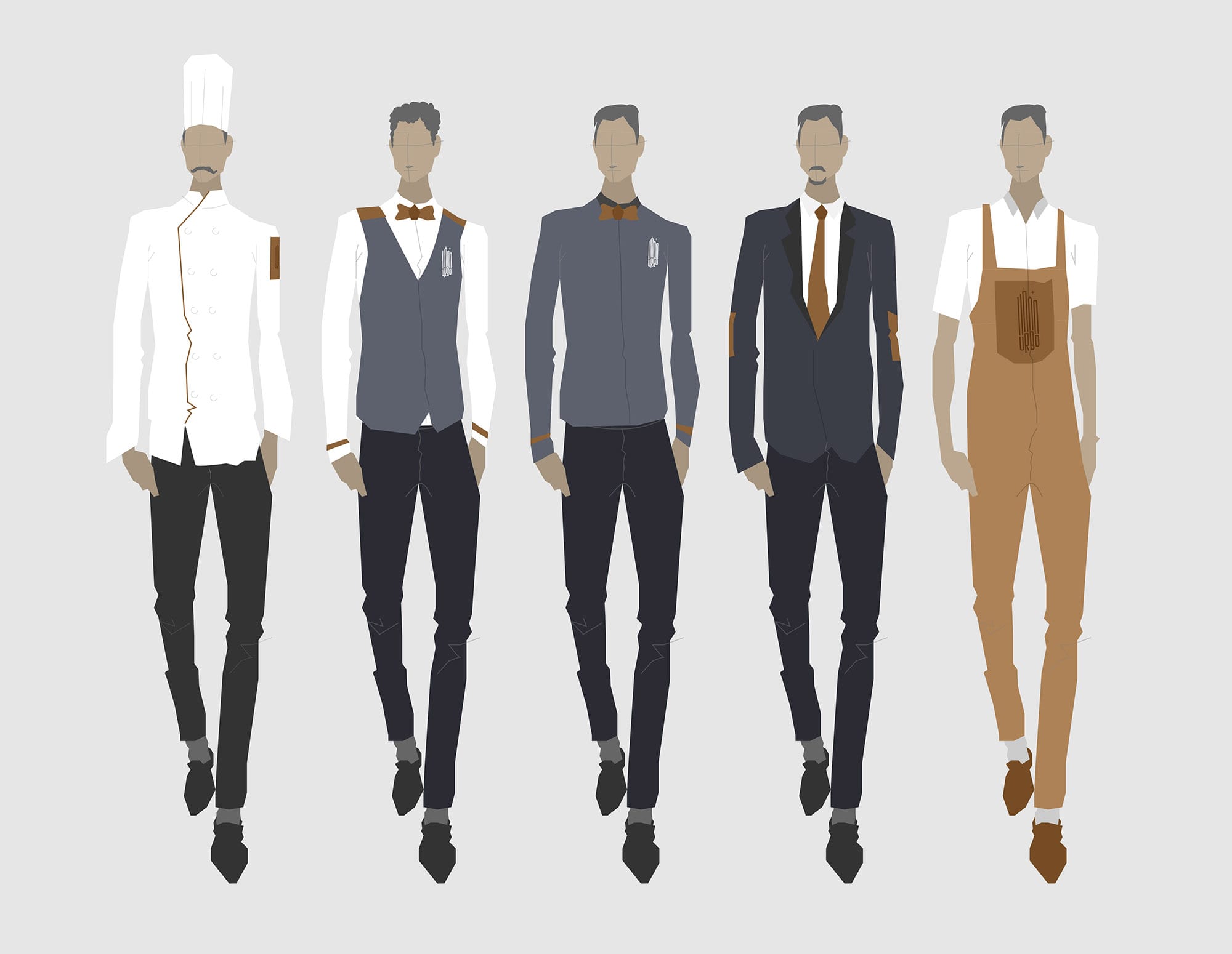
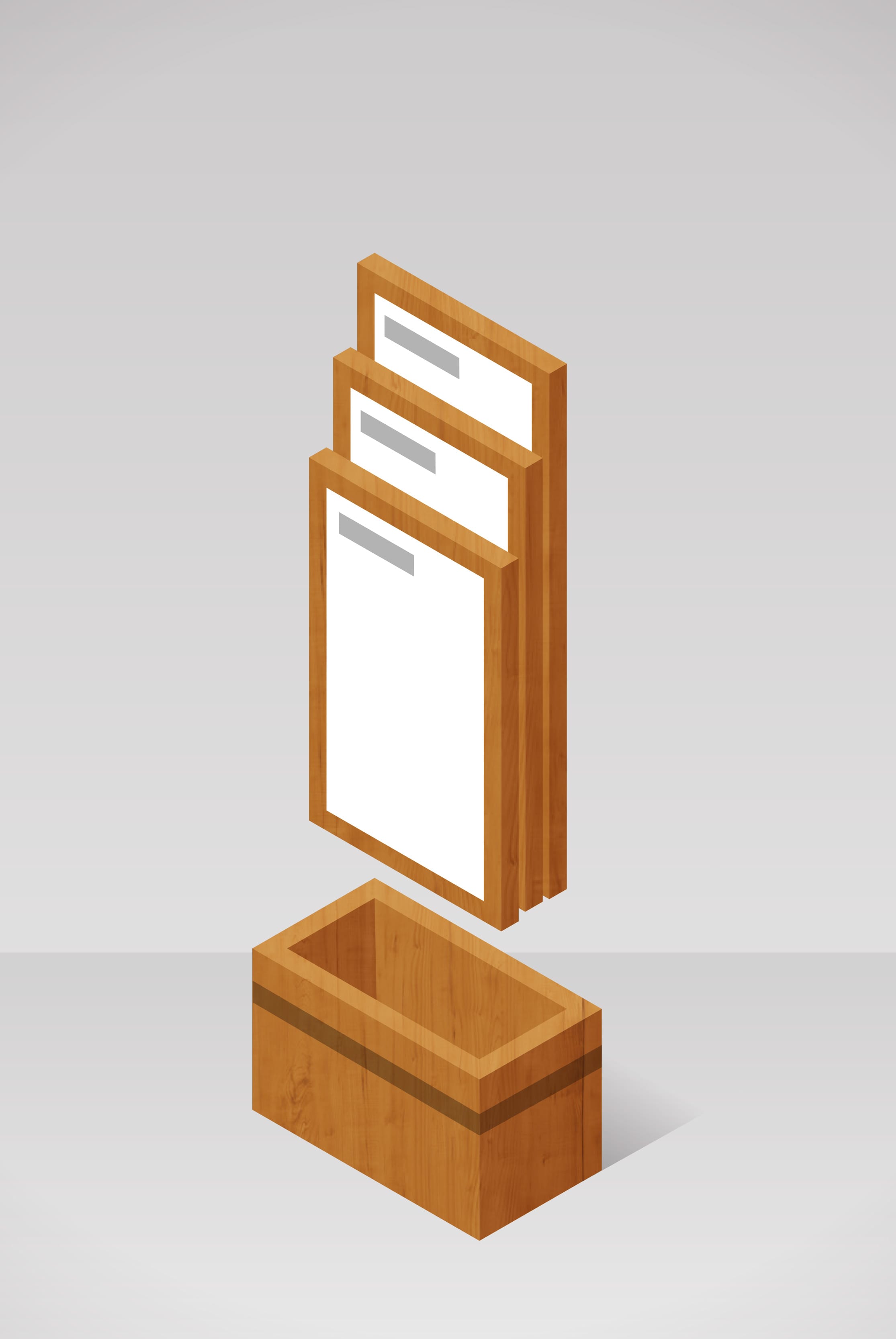
For Urbo I presented an alternate modular menu card system, where you 'take parts' of a menu set and pass it around, depending on the section you want to refer to.
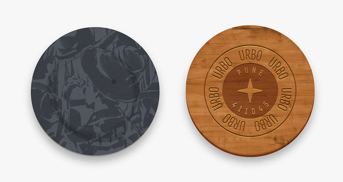
Coasters: disposable ones in paper and permanent ones in engraved wood
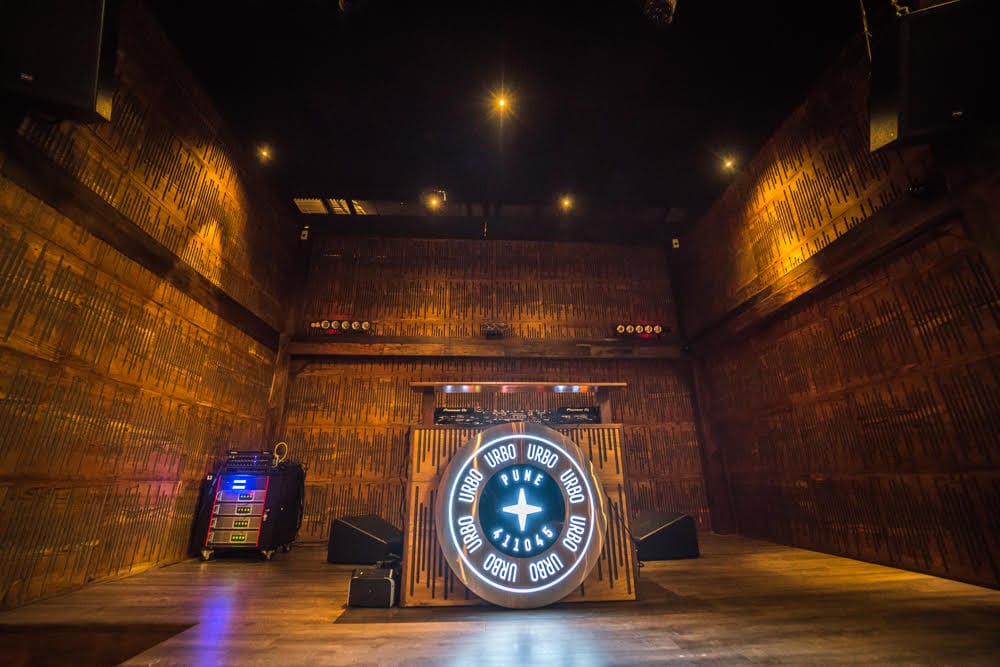
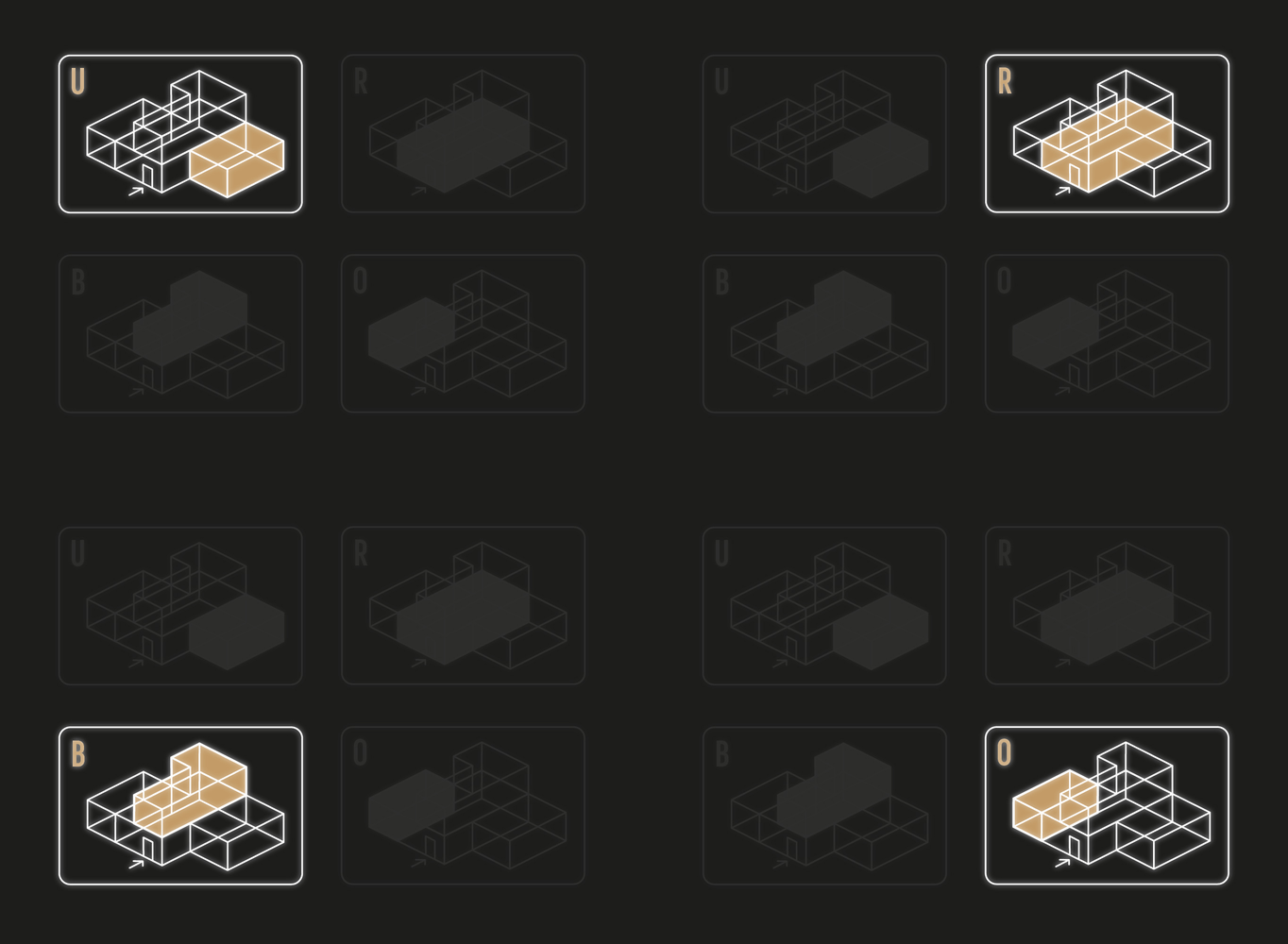
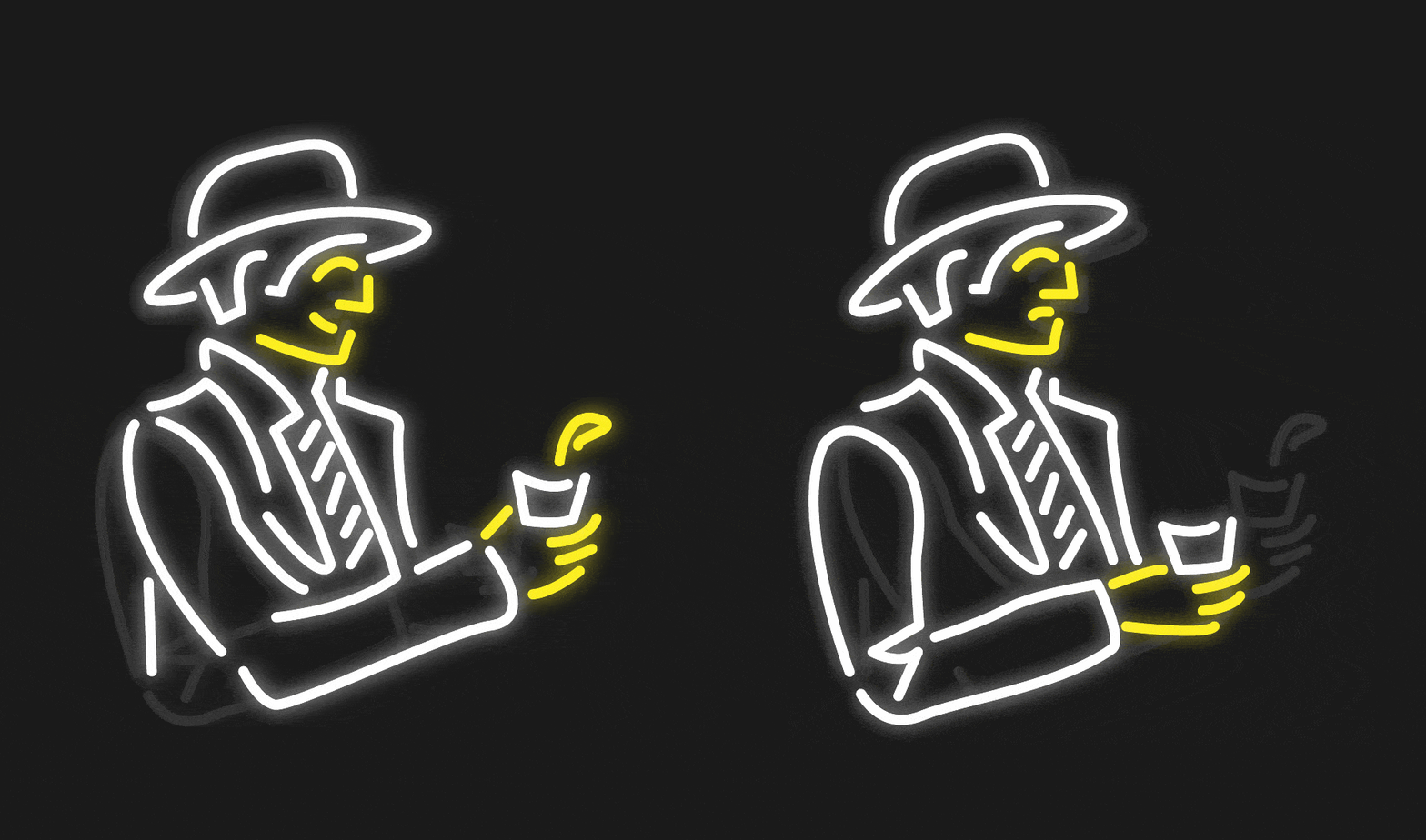
Concepts for neon wall signs. The first one recreates the 4 different properties within the space.
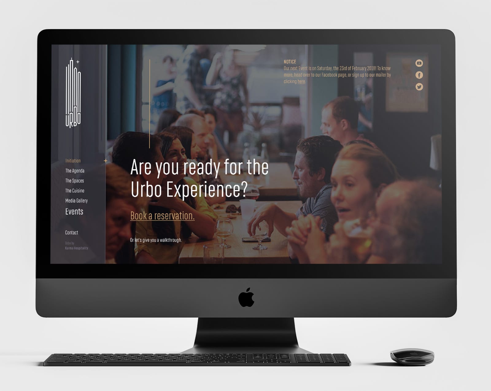
Urbo's website is intended to play a 15-second video of the events and moods of the space from the month gone by.
